%20(1024%20%C3%97%20500%20px)%20(24).png)
We know you’re busy—no one is busier than a nonprofit team in the middle of year-end giving—but we wanted to pop in and share a quick tip you can try to give your campaigns a shot of energy.
CharityEngine has offered plenty of road-tested tips to increase year-end fundraising, including the best ways to use different channels for big results or the most important things to do the last few days of December. Today, though, we’re going to get specific and show you one thing you can do that has been proven to increase conversions on your website. And you can try it at any time of year!
If you’ve been around this space for a while, you know how much we love the data-driven approach of NextAfter. We’ve had them present on webinars and seen them slime people at conferences, and we refer to their research often when we need statistics and experiments in our arsenal.
We’ve recommended a home page takeover in past articles on fundraising because it works. Thanks to NextAfter, we can share a study that proves it!
What is a Home Page Takeover?
It’s taking one of the most-trafficked pages on your website—your home page—and turning it into a donation page.
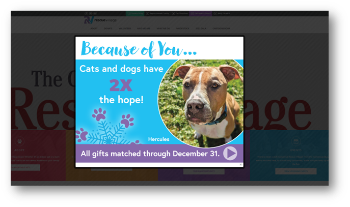
Here's an example of what it looks like. Our client, Rescue Village, has a great website. But for year-end giving, they take over the home page! By superimposing a call to action, every website visitor is led to donate before exploring volunteer opportunities or even learning about some of their events.
 We know, and NextAfter set out to prove, that directing all of a website’s traffic to a donation page results in higher conversion rates.
How NextAfter Tested This Theory
The study organizers wanted to see if reducing the steps between a website visit and a gift would increase conversion rates. The experiment was around the calendar year-end campaign of a company called International Mission Board. The experiment allowed some donors to see a treatment page with a link to "go to imb.org" as an exit option instead of the standard homepage, and the treatment page explained the impact of a year-end donation. The team included 25% of the traffic in the experiment.
NextAfter found that while traffic and average gift size didn’t increase, conversion rates increased by 30.6%. Because the sample size exceeded the minimum requirements for validity, NextAfter stated that the confidence level in the results is above 95% and the results are valid.
What does this mean for your nonprofit? Having a home page takeover in your toolbox can be used when you need a quick boost in fundraising.
When and How Does a Home Page Takeover Work?
If your website is a revolving door of different home pages, a temporary splash page isn’t going to attract much attention. So use them sparingly. If you’re nimble and can try it this year-end giving season, give it a shot. Otherwise, plan to incorporate a home page takeover into your next campaign.
When used correctly, a home page takeover will:
- Raise awareness about your campaign
- Add urgency to a giving push
- Allow you to communicate timely information, such as gift matching
And there are some best-practices tips you’ll want to consider as well:
- Have a clear call to action on the takeover screen.
- Don’t combine a home page takeover with other tactics, like a banner ad.
- Give folks an easy exit back to your home page. The idea is to reduce friction, not frustrate them because they can’t get rid of the overlay.
- Keep the takeover brand and content in keeping with the rest of your website. You don’t want donors to wonder if you’ve been hacked!
- Using strong visuals can help underscore the urgency of your plea.
- Have a clear end date. Perhaps the takeover runs for two weeks and is then promptly removed.
Don’t Forget Donation Forms
Let’s say you try a home page takeover, and your donation form is on fire with at least 30% higher conversions. Please don’t underestimate the importance of an optimized donation form!
Getting donors to your website is important, and getting them to your donation form is even more important. But with the average nonprofit donation page seeing abandonment rates up to 70%, it’s critical you pay attention to how that page looks and acts.
A recent blog post offers ten tips to create the perfect donation form; we’ve linked to it to keep this post brief. If you’re more of a checklist person, this donation form checklist is a quick list you can scan to be sure your page is optimized.
Shake Up Your Fundraising!
We’ve got a whole guide on ways to shake up your fundraising, but you can start with this tip. Try it! If you want proof it’s working, then A/B test it by having 50% of your website traffic see your standard home page and 50% see the takeover.
Home page takeover or other tactics can help your nonprofit stand out in a crowded field at a busy time. If you launch a home page takeover, please let us know! We’d love to shine a light on your nonprofit and share your results.
For more insights, subscribe to our newsletter. We consistently offer tips that will help any nonprofit, even if you’re not a CharityEngine customer. And, of course, we’re always happy to show you our software or have you talk to clients in your field if you’re curious about what makes us so unique.
Scale Your Fundraising
See how top-performing nonprofits keep a human touch while growing rapidly.
Schedule your 15-minute call

.png)
.png)