The holy grail of every successful nonprofit is a snazzy, beautifully branded donation form. No matter what amazing multi-channel outreach campaigns you run, everyone’s going to end up in the same place: staring at your donation form.
And, not to scare the pants off you, but the average nonprofit donation page sees a 50% to 70% abandonment rate. So the pressure is on to make sure your donation form outperforms every other nonprofit donation form on the market.
We're here to help! This article will share some general tips on how to make your forms awesome. And if you're a CharityEngine client or thinking you might want to find out what all the CharityEngine fuss is about, we cover some of the ways our CRM helps you maximize donations.
Whether or not you're a client, we promise some great ideas and proven techniques to keep your donation form from getting ditched. You can get a free Donation Form Optimization Checklist here...it's a handy tool that will remind you of tips to increase donations.
How to Create a Perfect Donation Form
Creating a perfect donation form is as easy as considering your experience and preferences. What drives you crazy? Any of these things?
- Too many fields
- A crowded form
- The dreaded squares with traffic signals you have to select
- Wordswordswords that run together because there are so many
You get the drift. Forms can be highly annoying, whether you’re running to the other room to grab your credit card because you don’t know the CVV number (or you have to Google "what are CVV numbers") or you keep getting stumped because some elusive required field wasn’t completed, they can be a big pain in the rear.
Whenever we want to prove points with rock-solid statistics, we head over to our friends at NextAfter. They spend every day nerding out over statistics that the rest of us can use to be more effective, and you can use to be a smart digital fundraiser. Remember when Nathan Hill joined CharityEngine for a webinar on year-end giving? Not to try to pull you away from this all-important form tutorial, but plan to watch that webinar for fascinating tricks to increase year-end giving.
Let’s review the top ten tips for an effective donation form. Each of these has been proven to improve your donation page and help you raise more money.
- Keep your header simple – no navigation and no donate button. (No header led to a 195% increase in donations.)
- Focus on design. Keep it simple so the form is readable.
- When you consider a headline, make sure it spells out the effect of a donation.
- If you want to include a background image, make sure it’s relevant.
- Begin with a concise value proposition. Why does a donation matter? Adding a value prop can increase donations by almost 260%.
- Do you need a main image? If you have one, make it compelling.
- Don’t include video on your donation page. NextAfter saw a 560% decrease in donations when a video was present.
- Keep it short! Body copy should be brief and even bulleted for easy reading.
- Offer several payment options.
- Reinforce your message in your call to action. For example, you could add “Your gift will help feed hungry families this holiday season.”
CharityEngine stands behind all that advice. From the design to the messaging to the call to action, keeping things simple and clear will always boost your conversion rates.
CharityEngine Donation Forms: Better Than the Rest
Can you have crazy wild donation form success without CharityEngine? Of course you can. But if you’re a client, some things really do give your forms the edge. Let’s take a look at them.
What your donation form looks like—the ten tips we listed above—can absolutely make a difference. But let’s move beyond them and talk about how your form actually works.
It comes down to what is known as frictionless giving. It’s about making it so easy for supporters to give that there aren’t any obstacles.
Think about how the Red Cross raises money. One strategy is that donors can text the word REDCROSS to 90999 and, in an instant, they’ve donated $10 to American Red Cross Disaster Relief. The charge shows up on the donor’s next wireless bill.
Clearly, this is brilliant and effective on many levels. But what catches our attention is how very easy it is to give. In a matter of seconds, a donation can be completed.
How does CharityEngine build frictionless giving into its donation forms? Here are five features worth noting.
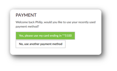
- One-click giving. With CharityEngine forms, donors enter their information once. The system recognizes a returning donor and their payment method, so there’s no digging out credit cards or hunting for codes.

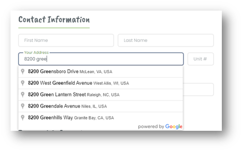
- One-line address entry. Because the CRM is integrated with the United States Postal Service, all a new donor has to do is start typing their address. The system autofills the details.

- Single Sign-On. When a nonprofit has a database, then an email provider, then a payment processor, and then an event platform, donors can be asked to create multiple logins for things like transactions or event registrations. CharityEngine’s fundraising tools are all native to the system, so your donors have one login.
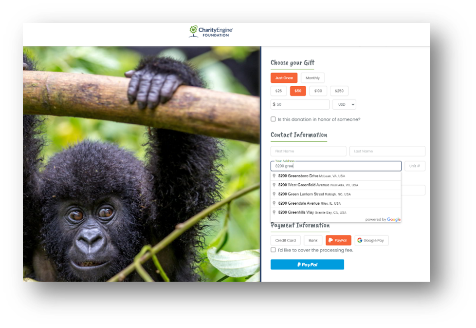
- Multiple Payment Options. Did you know that virtual wallets can increase your conversion rates? A PayPal button alone can increase donations by 32%. When you offer secure credit card processing, in-house ACH processing, and virtual wallets, you’re letting donors give how they want.

- Advanced Fraud Protection. Did you know that CharityEngine’s Advanced Fraud Protection is patent pending? That’s how valuable this technology is, and it’s only available to CharityEngine clients. When enabled, the system can identify fraud attacks before they hit the payment processor and block them. Not only is your nonprofit safe, but you’ll save money when you don’t have to pay transaction fees on fraudulent charges. Oh – and it can eliminate the need for CVV or Captcha.
Donation Forms Can Improve Your Fundraising
Whether you’re interested in the front-end improvements you can make or the back-end technical wizardry we provide, this article will help you make some changes to increase your conversion rates and help you win donors. And no matter who your CRM vendor is—and there are plenty of good ones out there—make sure they’re your partner, willing to share tips and technology to make your nonprofit as successful as you can be. If you want to explore CharityEngine to see if we’d be a good fit, just shout.
Scale Your Fundraising
See how top-performing nonprofits keep a human touch while growing rapidly.
Schedule your 15-minute call

.png)
%20(10)-1.png)