
All you have left from Thanksgiving is pants that don’t fit as well as they used to, and the holidays are staring you in the face. If you haven’t hit your nonprofit’s fundraising goals, it’s too late, right? NO!
NextAfter is an organization that helps nonprofits grow their fundraising, so VP Nathan Hill was the perfect choice for our December webinar. Nathan chatted with us about data-driven techniques to amp up your fundraising at the end of the year.
In case you don’t have time to watch the webinar, we’ve got all the tips you need right here. What follows is a recap of NextAfter's presentation.
Let’s Put it in Perspective
December is 1/12 of the year. The last week of December is 1/52 of the year. So how can it possibly be so important?
Here are some statistics to put it into perspective.
- In 2021, the average nonprofit brought in 45% of its online revenue during year-end giving.
- This same year, according to NextAfter, nonprofits brought in 4% of their online year-end revenue on GivingTuesday.
- By December 31, the last day of the year, they had brought in 20% of their online revenue.
- But…and here’s the kicker….47% of their online year-end revenue came in after December 25.
So you slept on GivingTuesday? It’s okay. Wake up now because you have plenty of time to knock those fundraising goals out of the park.
The risk lies in not really focusing on GivingTuesday, and then not really focusing on the last week of the year, either…especially since the last week of the year brings in 924% more revenue than GivingTuesday.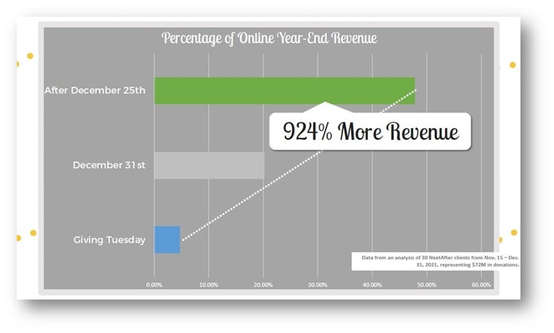 So what you can you do to make the most of the last week of the year? There are three essentials that will lead to a successful effort: your emails, your website, and your donation page.
Let’s look at each one.
Optimize Your Emails
What emails can you and should you be sending?
The key concept is to increase urgency without rehashing all the reasons donors should give.
They know, from all your past communications, why your mission matters. Your job now is to compel them to give amidst many competing voices.
There are three categories of emails you can be sending throughout the year-end season:
- Cultivating or priming emails communicate your mission and the importance of supporting it so that donors are prepared (and knowledgeable) when you ask for a donation.
- Appeal emails are the ask. What’s at stake? How can the donor make an impact?
- And finally, there are closer emails. These are most effective when urgency is the highest, and you are the closest to reaching a goal. This is what will help you at year-end because the urgency is built right in.
Closer emails remind your donors there’s a deadline. This can mean using words like “give now!” or a countdown. This email doesn’t offer reasons why they should give, it clearly states that they should give now instead of later.
There are a few communications in closer emails that work:
- The clock is ticking, and donors will help you more if they give by midnight tonight (or whatever your deadline is).
- Give now, and your gift will be doubled or tripled… what does that look like? How many pounds of food will that buy or abused animals will it save?
In a test of a longer email describing why someone should give and a shorter email that reminded them to give, the reminder led to a 30.7% increase in donations.
Another type of closer email is a reminder of the deadline reminder you sent. This is a kind, personal email that’s sent to donors to ensure they didn’t miss your deadline. You can forward your appeal email and ensure they saw the deadline. Data shows that this “forward” email leads to a 73% increase in donations.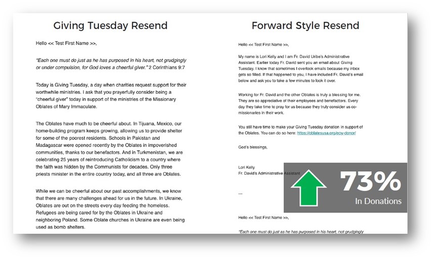 Emails are one of your most valuable tools and lead to high conversion rates. But you can also tweak your website to work for you.
Optimize Your Website
At this time of year, your website visitors are motivated to give. How can you ensure your website will make it easy to get them to follow through?
The key concept is to make it easy for people to find where and how to give.
There are design elements you can include to light the path for donors. These can include sticky bars, homepage ads, pop-ups, or slide-outs.
Let’s start with your navigation.
When we look at your navigation, where is your “give” or “donate now” button? Studies showed that even making this button higher contrast – an easy fix – led to a 28% increase in clickthroughs.
In another study, a treatment that increased the contrast of the donate button led to a 190% increase in donations.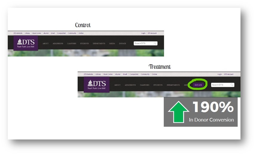
When someone new looks at your website, be certain they immediately know how to donate.
What about homepage ads?
You can use lots of the real estate on your homepage for ads, but it’s important to know when they will perform the best.
One example was evaluating the homepage banner on a nonprofit site. It urged donors to “double your gift!” and drew attention to exactly how they could donate.
When the ad ran in the first half of December, the conversion rate was 1.1%.
When the same ad ran in the last week of the year, the conversion rate was 4.6%.
So when you run the ad is almost more important than what the ad says. Your takeaway is that you’ll see results from a homepage ad at any time, but it will be most impactful running at the end of the year.
How about the message? It’s important to be clear about the reasons to give and how that gift will make an impact. In this example, explaining how donors can change a life led to a 35% increase in donations.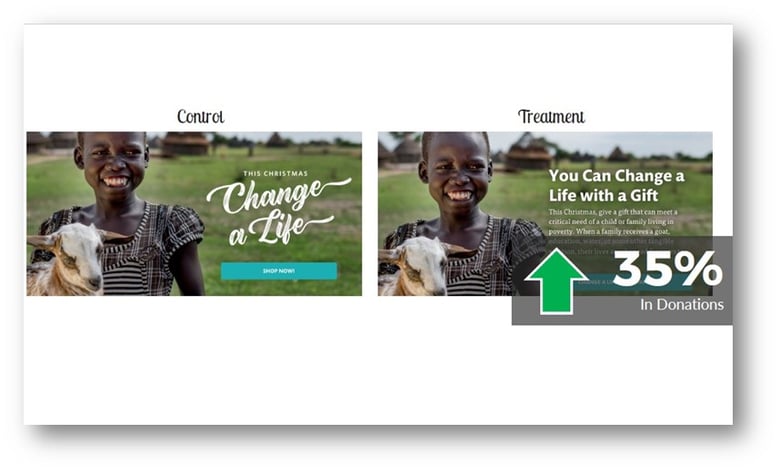 So the copy and messaging are critical: why should they give to you, or at all? Add some value proposition copy to drive the message home.
How about timed pop-up ads?
These can be a little obnoxious, which you know if you’ve tried to get a recipe you’ve pulled up on your phone.
But used carefully, they’re effective. When someone has been on your website for ten or 15 seconds, it can be a simple and gentle reminder that time is running out to give. Don’t put it on every page of your website, or you’ll veer toward obnoxious! Place it carefully and sparingly.
In this example, a simple, benefit-driven popup resulted in a 56.7% increase in clicks.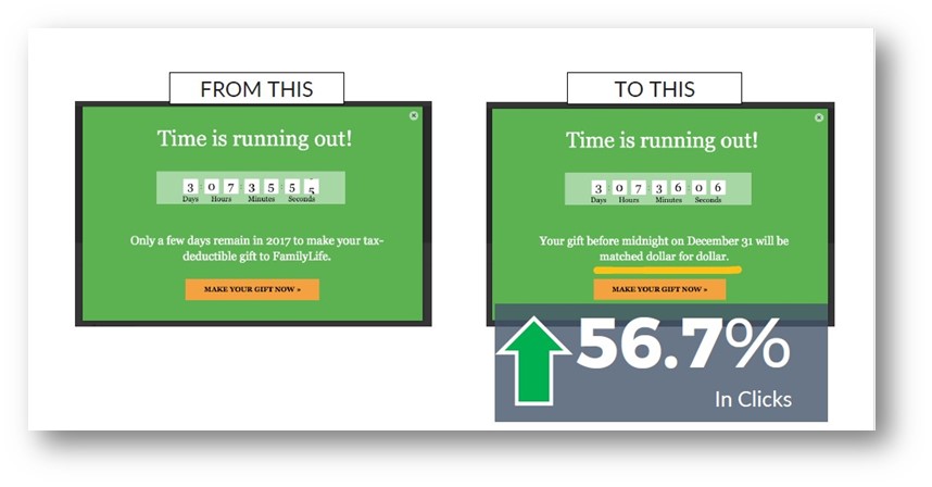 Exit-intent popups fire when you’re indicating you’re ready to leave the website. This is a “Before you go…” popup that can use social proof to draw someone’s attention to the chance to join others before they leave the site.
An abandoned-cart popup is one you might see after you fill your shopping cart online and then get distracted and forget to check out. In this example, you’re asking the donor to complete their donation with the click of a button. This led to a 41% increase in donations!
Pop-up ads can drive new donation page traffic, capture exiting visitors, and remind donors to complete their gifts.
In-Article Ads
This technique can be effective when a donor is reading your content. It’s an ad that looks like a native piece of content and discusses the opportunity to give. Studies show this can be enormously effective.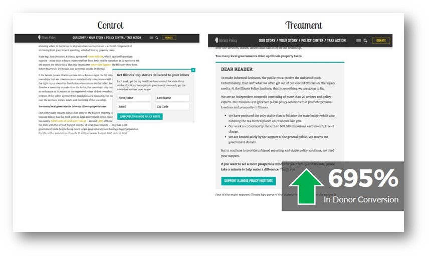 No one goes to Wikipedia to make a donation, but when they (brilliantly) ask readers for a few dollars to keep the site alive, donations pour in. Just putting the opportunity in front of people is sometimes enough.
And finally, how about a homepage takeover?
This is a little complicated, but it’s basically replacing your homepage with an appeal that links to a donation form. It’s a one-click gift.
You can include a link to bypass the appeal to keep the user experience smooth.
While this example showed an 11% increase in donations, it’s interesting to break those numbers down further.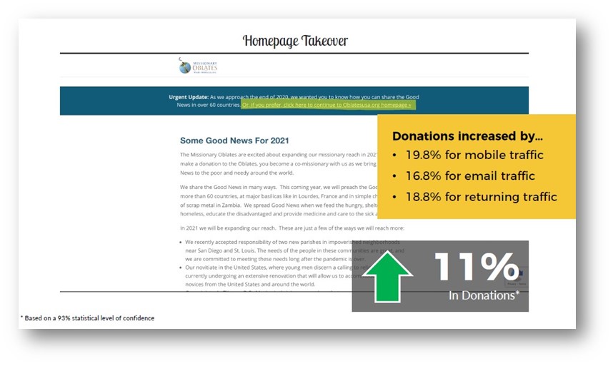
Use this homepage takeover technique in the last two days of the year for maximum effectiveness.
Optimize Your Donation Page
There are a few essential things you can do on your donation page during the year-end season to increase conversions.
The key concept is to emphasize your incentives and increase urgency throughout.
Regardless of how you’re reaching out to your donors, you’re sending traffic to your donation page. But this can cause whiplash…your campaign materials—whether direct mail, email, ads, or even your website—all talk about why your cause matters and how donors can help.
When they’re spun off to a donation page that doesn’t communicate any value, they can get whiplash. And whiplash, as you’d guess, is a pretty crummy donor experience.
You need a cohesive year-end donation page. This can be as easy as updating your regular donation page with some of the messaging you’ve been using, but you do need to send folks to a dedicated year-end page.
Here are some reminders for the donation form adjustments:
- Make sure the headline tells people they’re in the right place to make the year-end donation.
- The body copy articulates what the problem is and what the solutions are, and what the impact of a donation is. You need a clear call to action. But when you adjust the copy to make it clear the donation will be in response to your year-end campaigns, you can raise donations by more than 12%.
- Countdown clocks are easy to implement and drive urgency. They’re effective, too, leading to a 61.8% increase in donations in one study. A note on countdown clocks: use them closer to the end of the campaign for maximum effectiveness.
- Progress bars can make donors feel like they’re part of a group effort to reach a goal, which can be motivating. They drive urgency and let people see the difference they make. In the example shown, having a progress bar led to a 20.5% increase in revenue per visitor.
Here’s a thought on progress bars. This study tested a “thermometer” approach versus a “power hour” approach. In the former, they found that people felt as though their donation was ineffective. In the latter, donations rose 25%.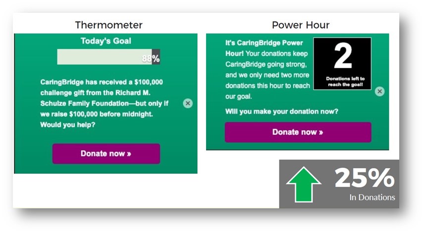 And finally, having an incentive on your page is good. But if you add a high-contrast sticky bar to the top of the page, a study showed that can lead to a 44% increase in donations. Make sure it’s abundantly clear to be impactful!
Tools You Can Use
We wouldn’t leave you with all this advice and no idea of how to implement it! Here are some tools to check out:
For sticky bars and popups, check out Unbounce or Sumo.
For countdown clocks, try MotionMailApp or Powr.io.
And for dear-readers ads or customizations on your pages, give Google Optimize a shot.
Year-End Giving Has Met its Match!
And its match is you!
So much of the content we share is designed to educate nonprofits on the best way to raise money and make their mission more achievable. Armed with these tips from our friends at NextAfter, you’re already well on your way to making a huge impact in the last week of the year. If you would like to take a look at our platform, trusted by nonprofits like Wounded Warrior Project, just ask us to show you.
Scale Your Fundraising
See how top-performing nonprofits keep a human touch while growing rapidly.
Schedule your 15-minute call


