Website Accessibility: What Your Nonprofit Needs to Know
 by Julie Kennon
Website accessibility isn't always top of mind, but it's critical for a positive donor experience. This article breaks down what you need to know!
-1.png)
Of course you want anyone at all to visit your nonprofit website. And of course you want them to understand your mission and see how they can support you. Right? That’s why you have that bright green donation button on your home page.
This is great until someone who really cares about your mission comes to your site and can’t see it because they’re visually impaired.
And that’s why accessibility matters.
What is Website Accessibility?
Website accessibility ensures everyone has a similar experience when they visit your website, regardless of disabilities, impairments, and limitations.
What are the limitations that should be addressed?
- Blindness or low vision
- Deafness or hearing loss
- Learning or cognitive disabilities
- Physical or speech disabilities
Is Website Accessibility Optional?
Not really, for many reasons. There is an organization tasked with oversight and enforcement of web accessibility. It’s called The World Wide Web Consortium (W3C). They release Web Content Accessibility Guidelines (WCAG) that offer details on how any organization, nonprofit or not, can ensure compliance.
But let’s be honest. W3C isn’t likely to bust down your door because your photos don’t have alt tags. The bigger risk is that you’re alienating donors, which is even worse than having W3C after you.
Having an accessible website also demonstrates inclusivity, which is appealing to supporters.
At CharityEngine, we’ve baked donor care into our nonprofit CRM because we know it’s vital to building and sustaining a strong and effective nonprofit. Website accessibility is one of the most basic tenants of donor care.
Four WCAG Standards
Let’s break it down. What are the four main ingredients of an accessible website?
1. Perceivable. Visitors must be able to understand and be aware of the content on your website. This means that things like alt tags on photos, for those using screen reader software, is critical.
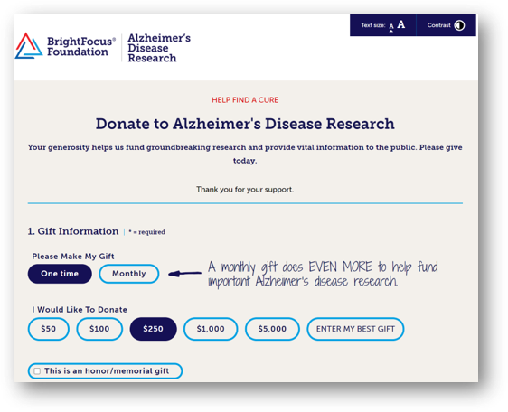
A great example of accessibility comes from our client, BrightFocus Foundation, which works to cure Alzheimer’s Disease, Glaucoma, and Macular Degeneration. Aware that many of their supporters might have trouble viewing their site, they called on CharityEngine to customize their donation form. Here is the way it appears to users: 
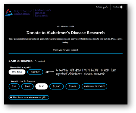
But note the upper right-hand corner, where users can alter the text size or the contrast. Push a button and the page transforms for readability:

It’s a strong example of how CharityEngine can help you engage your donors. It’s also very cool to see the web page transform!
2. Operable. Operable websites don’t disrupt any type of user. This means that any user should be able to use their keyboard to navigate content. This means you can tab from section to section and you’ll never get lost or trapped in content on a page.
3. Understandable. Everything needs to be understandable, including written content, graphic design, and even navigation. Keep things uncluttered and simple and follow a clear structure. This can look like dropdown lists under your navigation. The cleaner the site structure is, the easier it will be for those using text-to-speech devices.
4. Robust. Content can be interpreted and consumable by all visitors, including those using devices such as screen readers. This means your code – HTML – should also be structured cleanly and logically.
How Can You Make Your Website More Accessible?
Let’s look at each of these four guidelines and learn some solid tips you can use today to increase visibility.
Perceivable
- Offer text alternatives, like alt tags on photos.
- Offer alternative ways to consume audio and video content, such as a transcript or subtitles.
- Structure content in an adaptable way, such as headings, lists, bold, and italics.
- Check your contrast so everyone, even those with color blindness, can read your content.
- Users should also be able to adjust background audio.
Operable
- As we discussed, make sure your site is navigable with a keyboard.
- Give users time to digest content, or the option to have more time if any action has a time limit (like a registration form timing out).
- Avoid blinking and flashing content. WC3 says that content that blinks or flashes more than three times in a second can trigger seizures.
- Use breadcrumbs, or navigation clues, so that users know where they are, and ensure clickable links are a different color so their intent is clear.
Understandable
- Write content at a sixth-grade level. That’s been proven to be understandable by the broadest range of people. If you must use technical terms and acronyms, define them clearly.
- Ensure your navigation makes sense.
- Make sure your error page tells a user what happened and how to fix it.
Robust
- Your HTML code should be well-written so assistive devices can read it. Use, for example, start and end tags when appropriate, and don’t duplicate tags.
How Can CharityEngine Help with Website Accessibility?
Compliance falls on the shoulders of nonprofits, but there are a few ways CharityEngine can help.
- As you saw with the BrightFocus form, we can customize any form to help with accessibility and ADA compliance. We have many nonprofits that support healthcare, disabilities, and degenerative diseases, so we are always thinking about ways to incorporate accessibility into forms.
- Any applications in our system that would be used by donors are highly customizable, so a client can change HTML or CSS attributes to achieve different levels of compliance. Additionally, CharityEngine has adopted WCAG standards for the framework of applications in our system, making sure they’re intuitive and clear.
- And of course, the framework of our donation forms meets WCAG requirements, so you’re in the clear, right out of the box.
A guiding principle for CharityEngine is donor care: making all donors feel welcome and appreciated. This extends to how we develop any modules or applications, so you’re always in expert hands.


.png)
